
This logo reflects agility — a goal of the business.
This neighborhood organization was founded after a devastating fire. Phoenix refers to the Greek mythological bird rising from the ashes. I designed the logo to show this movement up while referencing the hill location of the neighborhood.
This logo derived from the "sharpened pencil" metaphor for precision.
The name says it all so I created this logo to reflect the ideas of speed and the open road.
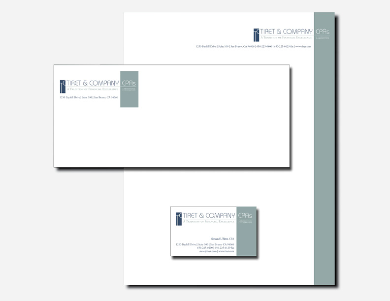
Stationary package including letterhead, envelopes, business cards, presentation folders, mailing labels, DVD labels, invoice templates, etc.
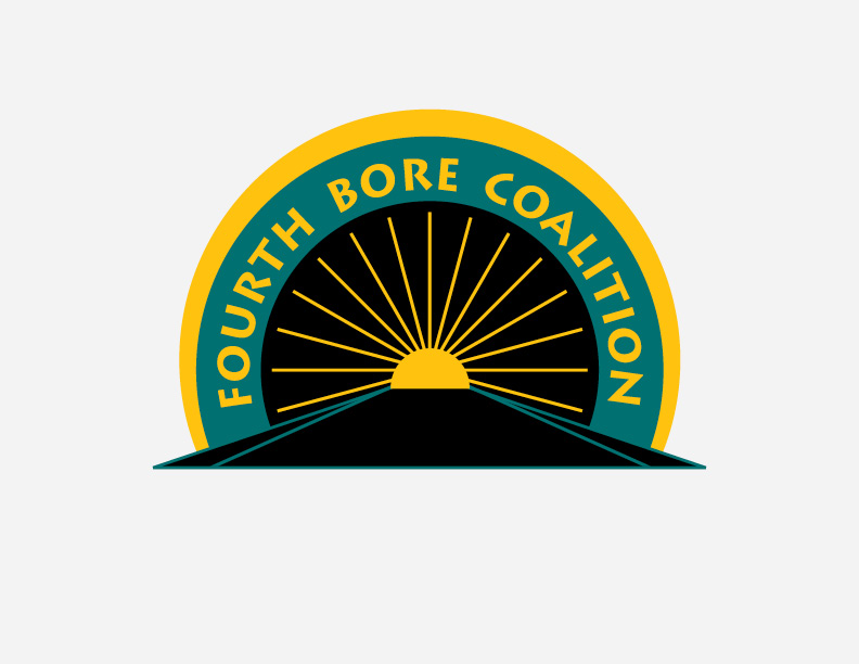
This group was dedicated to securing neighborhood compensation to offset increased traffic due to a tunnel expansion project. The logo suggested a brighter future while referencing the new tunnel.
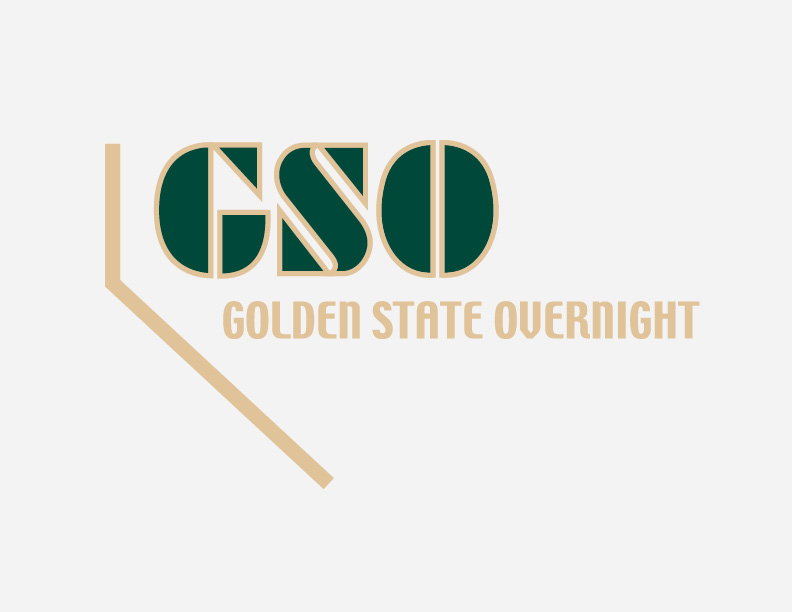
The line in this logo represents the border between California and Nevada which are the two states in the region covered by this delivery service.
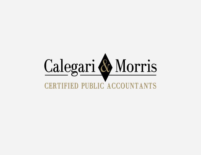
Calegari & Morris is an established accounting firm. The logotype was chosen to convey a classic, sophisticated firm. The gold foil reinforces the idea of wealth.
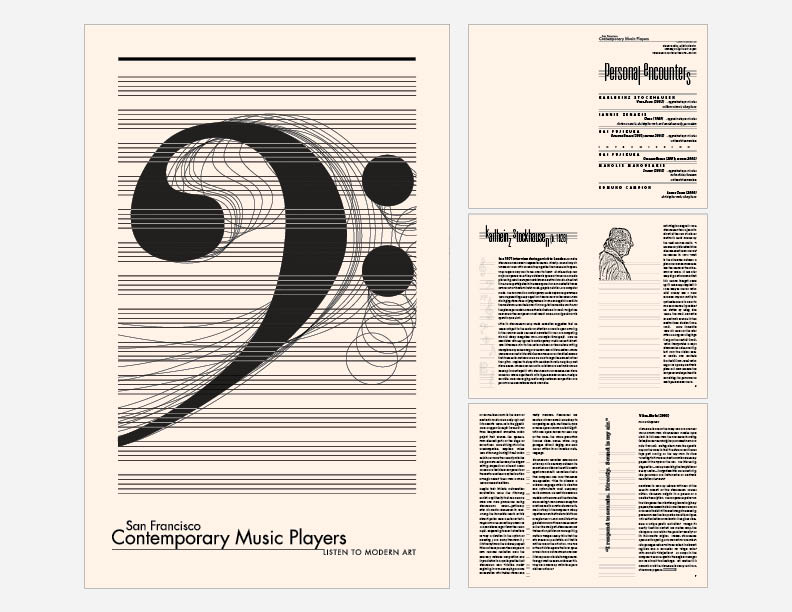
At the time this was created, the organization was operating on a shoestring budget. They wanted to be able to print their programs out of a black and white desktop printer. I created this design to reflect the modern eccentricity of the music. I recommended a nice card stock to give the program a pleasing physical feel and and an elegant look.
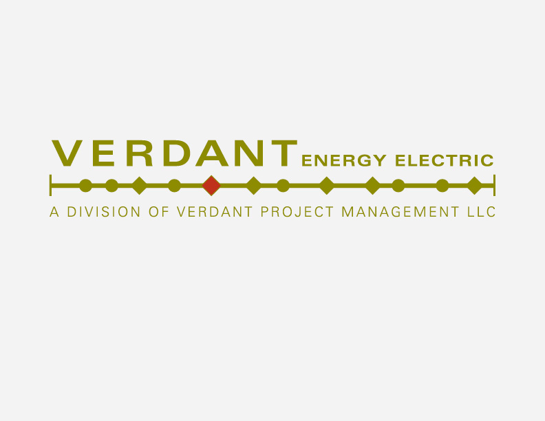
Verdant is a project management company. The logo is based on a timeline concept.
test